Size matters-Why is there a need for responsive technology?
The site is ready, the design looks solid, the support services are ready to go, there’s utter anticipation all around.
Just one problem, there is no/little response. Why?
It is because when you were completely focused and hell-bent upon making an exquisite website, perhaps a work of art, and the world switched to another platform which sadly your website does not cater to.
Customers make the markets, and right now, markets exist on mobile screens.
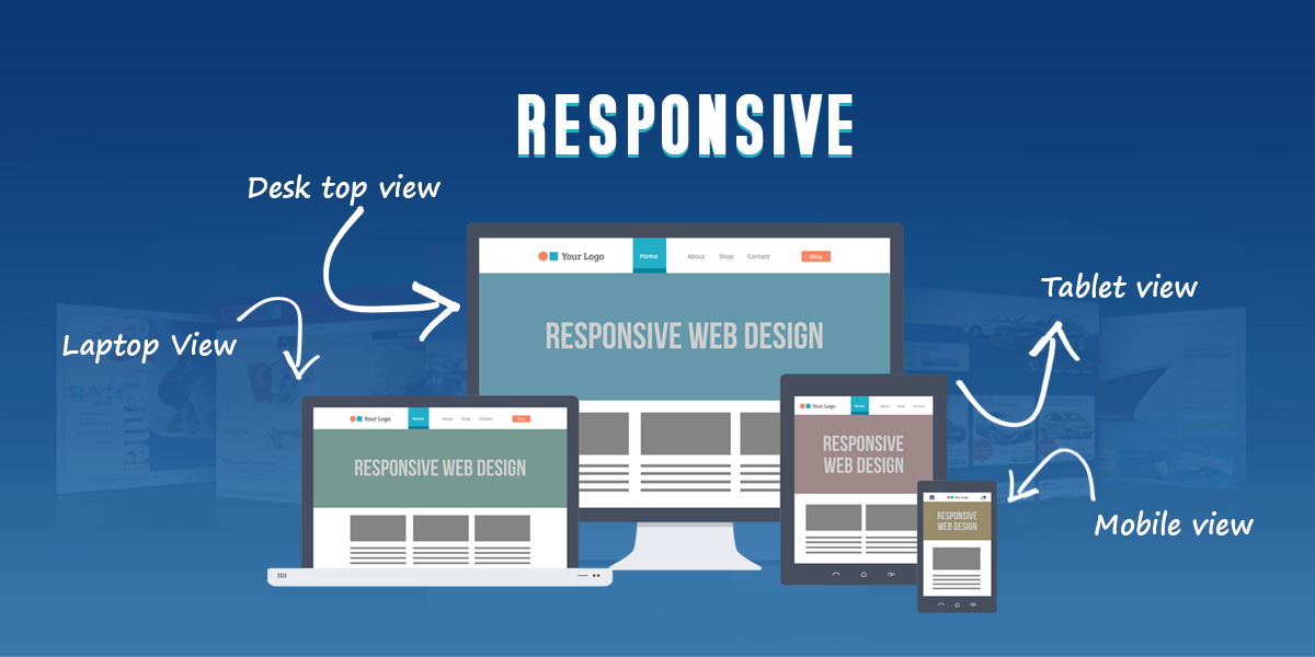
Responsive web design or simply, the need to develop websites which can easily function on desktops, laptops and mobiles, is the need of the hour. It is estimated that by 2030, more than half of the world’s population that exists on the internet will access it via mobile phones. With the barrage of smart phones that is happening, however, the day might be much closer than we imagine.
Responsive web design has emerged as a significant dynamic for websites due to a variety of reasons. Some of them are:
The sheer volume of mobile-internet users
As already explained, almost all the countries that have a major share of the population accessing the internet through devices such as mobiles, tablets, phablets, i-pads etc. For instance, more than 70% of the internet connected population in US own one or more network enabled devices and use them to access the same.
Quick action
It has been noticed that tablet and smart-phone users spend 50% more on purchases than what regular customers approaching through much more conventional means do. It is the instinctive action which results in such huge positive responses, which helps to earn better revenues.
Information in digestible nuggets
As the access to internet grows, so has the need for information to be available in small pockets which do not contain detailed information. Instead, they focus on direct and small bits of information which mentions clearly what to do and how to do it. This also helps in identifying and segregating active, ready-to-pounce-on-an-offer type of consumers, and the dormant ones.
User preferences
Users do not like to access services through a redirect, and downloading a dedicated application with a limited disk space is unattractive. As a result, a responsive website which can easily acclimatize with different devices through which it is accessed.
Cost savings
It becomes difficult to maintain multiple sites for the same domain due to higher costs as well as regular updates to be run on different platforms. A responsive site, however, cuts down on the costs while earning better brand value.
A well optimized website goes a long way in earning a repeated and loyal clientele. With the current population of smart-phone and other device users to rise exponentially in the future, the degree of responsiveness of a product or service’s website will emerge as a key determinant in ensuring continued progress. It also stands to benefit the businesses due to greater frequency of consumer’s purchases when the product is right at their fingertips, literally!